
5 stocks by industry mistakes that miss leaders
A troubleshooter for fixing “5 stocks by industry” screens that overlook the real leaders—spot classification red flags, expand your name set, avoid cheap-multiple traps, include new entrants, validate moats, and match comparisons to the right time horizon.
Why do “top 5 stocks in X industry” lists so often feel… wrong? It’s usually not your data feed—it’s your method: misclassified peers, too-small universes, value traps, and a time horizon that hides who’s actually winning.
This troubleshooter walks you through the most common failure points and how to correct them. You’ll learn how to rebuild clean industry slices, widen your candidate set without adding noise, filter for quality before valuation, spot early leaders, and test whether a moat is real—or quietly eroding.
Industry Mapping Wrong
Your industry buckets can be clean on paper and still wrong in reality. When that happens, you compare the wrong peers and crown the wrong “leaders.” You end up buying the best stock in a bad category, like calling Netflix a “DVD rental” leader in 2010.
Classification red flags
Bad labels show up when business models evolve faster than your spreadsheet.
- Mixes revenue streams across unrelated buyer types
- Wins via platform leverage, not product features
- Competes against “adjacent” firms more than listed peers
- Reports segments that don’t match your sector tag
- Sits in a peer set that feels too easy
If three or more hit, your bucket is hiding the real leader.
Rebuild industry slices
Re-slicing is about grouping by how money is made, not where a ticker is filed.
- Split revenue by driver, not by segment names.
- Group by customer type: consumer, SMB, enterprise, or government.
- Map value chain position: upstream, workflow layer, distribution, or marketplace.
- Rebuild the peer set from who wins the same budgets.
- Re-rank by unit economics: CAC payback, retention, gross margin.
Do this once, and “category leaders” start changing in front of you.
Leader definition reset
Market cap is often just a scorekeeper, not the game. Real leaders take share in the specific profit pool, set prices without losing volume, and shape the ecosystem others must plug into. Think “controls the workflow” or “owns the default distribution,” not “biggest ticker in the group.”
Too Few Names
You can’t find an industry leader if you only track two or three tickers. That’s how you end up “doing research” on the names you already know.
| Mistake pattern | What you miss | What you buy instead | Fast fix |
|---|---|---|---|
| 2–3 “obvious” tickers | Market-share leader | Familiar mega-cap | Expand to 10+ |
| Only US listings | Global category leader | Local proxy | Add ADRs, globals |
| Old watchlist reuse | New business models | Yesterday’s winner | Refresh yearly |
| One index screen | Unindexed compounders | Largest constituents | Use multiple sources |
If your list fits on a sticky note, you’re not mapping an industry—you’re memorizing it.
Chasing Cheap Multiples
Industry value screens often rank stocks by low P/E or EV/EBITDA, then call the top names “best in class.” That logic quietly punishes leaders that reinvest, depress current earnings, and widen their moat. You end up buying yesterday’s profits instead of tomorrow’s compounding.
Cheapness traps
Cheap can be real, but “cheap within industry” often means “something broke.” Watch for these traps before you trust the multiple.
- Buy cyclicals at peak earnings
- Trust low P/E with melting margins
- Ignore capex needed to compete
- Count one-time gains as operating profit
- Underweight share loss in “stable” markets
If the business needs a turnaround to look normal, the multiple is a decoy.
Quality-first filters
Flip the order: prove durability first, then negotiate price. Use filters that catch leaders while they reinvest.
- Track gross margin stability over cycles
- Require ROIC above peers and WACC
- Measure retention or repeat purchase behavior
- Confirm pricing actions stick without volume collapse
- Prefer consistent reinvestment into growth channels
Once quality is real, valuation becomes a risk-control tool, not the thesis.
When to pay up
Higher multiples can be rational when the business compounds and the market stays large. You’re paying for duration, not a single year’s earnings.
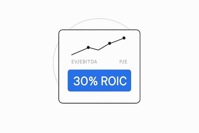
Look for long runways, recurring or repeat revenue, and reinvestment returns that stay above WACC even as the company scales. A leader with 30% ROIC reinvesting heavily can look “expensive” on today’s earnings while being cheap on the next five years.
Pay up when the moat is widening faster than the multiple is compressing.
Ignoring New Entrants
Stale industry lists miss the moment leadership changes hands. The new leaders often arrive through IPOs, spin-offs, or a sudden share grab while incumbents still look “safe.”
If your universe never updates, your screen can’t find what you refuse to include.
Freshness checklist
Use a repeatable refresh cycle so your industry list stays alive.
- Scan the IPO calendar for newly listed category creators.
- Track spin-off announcements for “hidden” pure-plays.
- Read regulator filings for segment revenue breakouts.
- Check niche ETF holdings for fast-added names.
- Log additions weekly, then re-rank your universe.
Your edge is recency. Most lists are stale by design.
Early leader signals
New leaders show up in operating data before they show up in “top stocks” lists. You’re hunting for a repeatable engine, not a good story.
Look for accelerating cohorts, distribution leverage, and product-led expansion into adjacencies, like a payroll tool that becomes an HR suite. When those three stack, the market often rerates fast.
The tell is compounding behavior, not a single quarter beat.
Add without noise
You need rules that let winners in without letting hype take over.
- Require minimum liquidity for real position sizing.
- Demand repeatable unit economics, not one-off promos.
- Verify catalysts with primary sources, not headlines.
- Set a watch period before “core” inclusion.
- Cap new-entrant allocations until execution proves out.
You’re building a pipeline. Not chasing the timeline.
Missing the Moat
The common screen-first mistake is buying the “best chart” or “cleanest ratios” before you know why the company wins. A 30% ROIC looks great until a new entrant copies the product and undercuts pricing. You’re not buying a metric; you’re buying the reason cash flows stay defendable.
Moat types by industry
Industries tend to reward specific structural advantages, so map your screen to the right moat first.
| Industry | Typical moat | What you check | Quick proxy |
|---|---|---|---|
| SaaS | Switching costs | Workflow embed | Low churn |
| Marketplaces | Network effects | Liquidity density | Short time-to-match |
| Semis | Scale | Cost per wafer | Gross margin lead |
| Utilities | Regulation | Rate base | Allowed returns |
| Consumer | Brand | Pricing power | Stable share |
If you can’t name the moat in one line, you’re probably buying noise.
For a useful framework, see Morningstar’s economic moat sources.
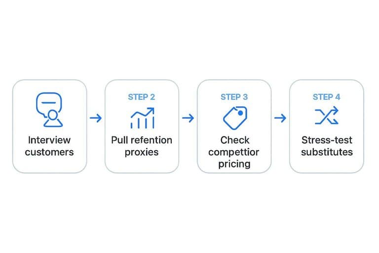
Moat validation steps
You can validate a moat faster than you think, but you must leave the spreadsheet.
- Interview 5–10 customers about “what breaks if you switch.”
- Pull retention proxies like cohort churn, NRR, repeat rate, and contract length.
- Check competitor pricing and packaging for discounting or forced matching.
- Look for cost-curve evidence like unit costs falling with scale.
- Stress-test substitutes that change the buying criteria.
Do this before you buy, not after you’re emotionally attached.
Moat erosion warnings
Moats usually die slowly, then all at once, so watch the leading indicators.
- Relying on subsidies, promos, or rebates to keep volume
- Seeing CAC rise faster than LTV or retention
- Watching competitors reach feature parity within quarters
- Taking price to hold share, then losing margin
- Shifting demand toward cheaper substitutes
When the moat cracks, the “cheap multiple” is often just the market updating first.
Wrong Time Horizon
A two-year lookback can make the best company look average. In semis or commodities, that window often lands on the wrong part of the cycle.
If you rank “leaders” off the last four quarters, you’re often just ranking timing. That’s how you buy peak margins and sell the bottom.
Cycle-aware comparisons
You need a cycle lens because earnings lie at peaks and troughs. Compare businesses on what they earn mid-cycle, and how they behave under stress.
- Map a full cycle with peak-to-trough margins and demand indicators.
- Normalize earnings using mid-cycle volume, price, and cost assumptions.
- Check capacity signals like utilization, lead times, and backlog quality.
- Score balance-sheet stress using net leverage and liquidity runway.
- Re-rank using mid-cycle returns, not last year’s growth.
Do this and “cheap” often flips to “structurally weak.”
Lookback defaults
Different industries reveal leadership on different clocks. Use lookbacks that match the operating cycle, not your spreadsheet default.
| Industry type | Typical cycle length | Suggested lookback | What to anchor on |
|---|---|---|---|
| Software | Short, steady | 2–3 years | NRR, margins |
| Semis | Boom-bust | 6–10 years | Mid-cycle EPS |
| Banks | Credit cycle | 5–8 years | Loss rates |
| Consumer | Mixed | 3–5 years | Share, pricing |
| Commodities | Long, volatile | 8–12 years | Cost curve |
Pick the wrong window and you’ll crown the best narrator, not the best operator.
Leader vs. survivor
A leader is still investing when the downturn hits. A survivor is cutting muscle to make the next quarter.
Look for leaders that protect share through strong liquidity, disciplined capex, and controlled operating leverage. They don’t say “we’re optimizing” as code for retreat.
If the cycle turns and they exit weaker, they were never the leader.
Run the Fix in One Pass
- Re-map the industry: rebuild your peer slice, remove classification red flags, and redefine what “leader” means for that business model.
- Broaden the universe: start with more names than five, then narrow using quality-first filters before you look at multiples.
- Refresh for change: add credible new entrants, validate the moat with evidence, and set a time horizon that matches the cycle so you’re finding leaders—not just survivors.
Frequently Asked Questions
Is “stocks by industry” the same as “stocks by sector” in screeners like Finviz or TradingView?
Not exactly. Sectors are broad (e.g., Technology), while industries are narrower groupings that vary by data provider (GICS, ICB, SIC), so the same stock can be classified differently across tools.
How do I build a better stocks-by-industry watchlist without missing the real industry leader?
Start with the full industry universe (30–100+ names when possible), then rank by multi-year revenue growth, gross margin stability, and market-share signals using sources like company filings, Koyfin, and FactSet/Refinitiv classifications.
What metrics should I use to compare stocks by industry when P/E and P/B don’t work well?
Use metrics that match the business model: EV/Revenue and gross margin for software, EV/EBITDA for asset-heavy industries, and free-cash-flow margin plus ROIC for most compounders.
How do I measure whether an industry classification is hiding competitors or substitutes?
Compare peer sets across at least two taxonomies (GICS vs ICB) and sanity-check with customer overlap, keywords in 10-K “Competition” sections, and who shows up in earnings-call competitor mentions.
How often should I refresh my stocks-by-industry list to catch IPOs, spin-offs, and fast share gainers?
Update it monthly and do a deeper quarterly refresh around earnings season, using IPO calendars, spin-off announcements, and industry revenue/market-share trackers to add new entrants early.
Find True Industry Leaders
Avoiding industry-mapping mistakes is one thing; consistently spotting emerging leaders, new entrants, and real moats—without chasing cheap multiples—takes a repeatable daily workflow.
Open Swing Trading surfaces potential breakout leaders with daily relative strength ranks, breadth, and sector/theme rotation context—use it alongside your charts with 7-day free access, no credit card.