Set Up a Post-Close Stocks Comparison Dashboard
A hands-on guide to building a post-close stocks comparison dashboard—define your EOD workflow, choose a reliable tool stack, model adjusted price data correctly, automate idempotent ingestion and backfills, and compute indicators efficiently for consistent daily comparisons.
Ever built a stock dashboard that looks great—until tomorrow’s close breaks your numbers, your symbols don’t line up, or a “quick backfill” silently duplicates rows? Post-close workflows are unforgiving because consistency matters more than real-time speed.
This guide shows you how to design a dependable end-of-day comparison pipeline: pick the right data source, store and model adjusted OHLCV properly, automate scheduled loads with quality checks, and batch-compute indicators so your dashboard updates cleanly after every close.
Define the Workflow
Your post-close dashboard is a daily snapshot for decisions made after the bell. Think, “What moved, why, and how does it stack up against SPY?” Define the scope and outputs now, or you’ll debug arguments later.
Post-close scope
Pick one official close and treat it as the source of truth for every metric. For US equities, that’s 4:00pm ET on NYSE/Nasdaq, even if your users are global.
Decide exchange coverage up front:
- US listed only (NYSE/Nasdaq/ARCA)
- Or add non-US venues with local close times
- Or normalize everything to a single timezone
Make an explicit call on after-hours. Either exclude it and label the dashboard “regular session,” or include it and show a separate “post-market change” column.
Comparison metrics
Choose a fixed set of fields so every ticker row is comparable. That consistency is what makes the dashboard useful at 4:10pm.
- Close price (regular session)
- % change vs prior close
- Volume (regular session)
- 20/50/200-day SMA
- RSI (14-day)
Add relative performance vs SPY, using the same lookback as your % change.
When these are locked, every debate becomes “signal vs noise,” not “which number are we using?”
Update cadence
Set a daily refresh window that matches your data vendor’s end-of-day finalization. Many teams pick “4:15–4:45pm ET” so late prints settle.
Decide four operating rules:
- Backfill: how many days to repair if ingestion fails
- Retention: how long you store computed indicators
- Missing candles: skip, forward-fill, or flag as incomplete
- Delisted tickers: freeze history, stop updates, keep metadata
Treat missing and delisted as first-class states, not edge cases.
Pick the Tool Stack
You need a stack that runs after the close, every day, without heroics. Keep it minimal: one data API, one database, one scheduler, one UI.
A clean connection looks like this: API pulls EOD data → ETL normalizes and stores it → scheduler runs jobs and alerts → dashboard reads from storage. Your “plumbing” decisions matter more than your charts.
Data provider
Pick a provider that matches your market coverage and how often you’ll refresh. The dashboard is only as trustworthy as splits and dividends handling.
| Provider | EOD coverage | Corporate actions | Cost / limits |
|---|---|---|---|
| Polygon | US equities strong | Good splits, dividends | Paid, higher limits |
| Alpha Vantage | Broad, varies by endpoint | Limited, inconsistent | Cheap, tight limits |
| Stooq | Global-ish, EOD focus | Sparse actions | Free, unofficial |
If you compare performance, corporate actions are the trap door.
Storage layer
Choose storage based on who reads it and where it runs. SQLite works great on a laptop; Postgres wins when your team shares the dashboard.
You need three core tables: symbols (ticker, exchange, active flag), prices (date, OHLCV, adjusted close), and indicators (date, symbol, metric, value). If you store both raw and adjusted prices, keep them in separate columns.
Design the schema once, then let every other component stay boring.
Dashboard framework
Pick the UI based on how fast you need results versus how custom it must be. Your first version should feel like a “working notebook,” not a product.
- Use Streamlit for fastest build and iteration.
- Use Dash for deeper UI control and callbacks.
- Host on Streamlit Community Cloud, Render, or a small VM.
- Add auth when it leaves your laptop.
If your dashboard needs logins on day one, you’re already in ops land.
Scheduler option
Your scheduler decides whether “daily refresh” is a promise or a wish. Pick based on where the code lives and how much failure handling you need.
Cron is fine for a single machine and simple jobs. GitHub Actions works well for nightly ETL with artifacts, logs, and easy notifications. Airflow is for multi-step pipelines with dependencies, retries, and strong observability.
Choose the simplest option that still gives you retries and searchable logs.
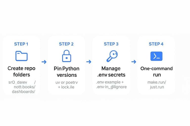
Create the Project
Set up the project once, then run it the same way every time. You want repeatable local runs, clean secrets, and no “works on my machine.”
- Create a repo with
src/,data/,notebooks/, anddashboards/folders. - Initialize Python with
uvorpoetry, then pin versions in a lockfile. - Add a
.env.example, then load real secrets from.envin.gitignore. - Create
make run(orjust run) to fetch data, compute metrics, and build charts. - Add a
READMEwith one command:make runand expected outputs.
If you can’t run it in one command, you don’t have a dashboard yet.
For deployment, follow Streamlit secrets management to keep API keys out of your repo.
Model the Data
You need a schema that stays boring under load. Your dashboard will hit the same joins every day, like “AAPL vs MSFT since 2018.” Model for those queries first, then compute indicators once and reuse them.
Schema blueprint
You’re optimizing for two patterns: fetch a symbol set, then scan daily rows fast. Keep raw bars separate from derived indicators so recomputes stay cheap.
| Table | Primary key | Indexes | Partitioning |
|---|---|---|---|
| symbols | symbol_id | ticker, exchange | none |
| bars_daily | (symbol_id, date) | date, (symbol_id, date) | by date (monthly) |
| indicators_daily | (symbol_id, date) | (symbol_id, date), indicator_set | by date (monthly) |
That split is what keeps comparisons fast when you add ten more indicators.
Ticker universe
A watchlist is a data contract, not a spreadsheet. Load it once, validate it, and persist the facts you’ll group by later.
- Import the CSV into a staging table with raw strings.
- Normalize tickers to your vendor format, including exchange suffixes.
- Validate each ticker by calling your market data provider once.
- Upsert into symbols with sector, currency, and timezone metadata.
- Mark inactive or delisted tickers instead of deleting rows.
If you can’t trust the universe table, every comparison becomes an argument.
Adjustment rules
Pick one adjustment policy and apply it everywhere, or your comparisons will lie. For example, a 2-for-1 split halves price and doubles shares, so unadjusted returns will show a fake -50% drop.
Use adjusted close for return-based comparisons, and store both adjusted and unadjusted OHLC when possible. Dividends change total return, so a “price-only” chart will understate performance versus a “total-return” line.
Write the rule into the dataset name, like “adj_close_total_return,” then never mix it mid-chart.
Ingest End-of-Day Data
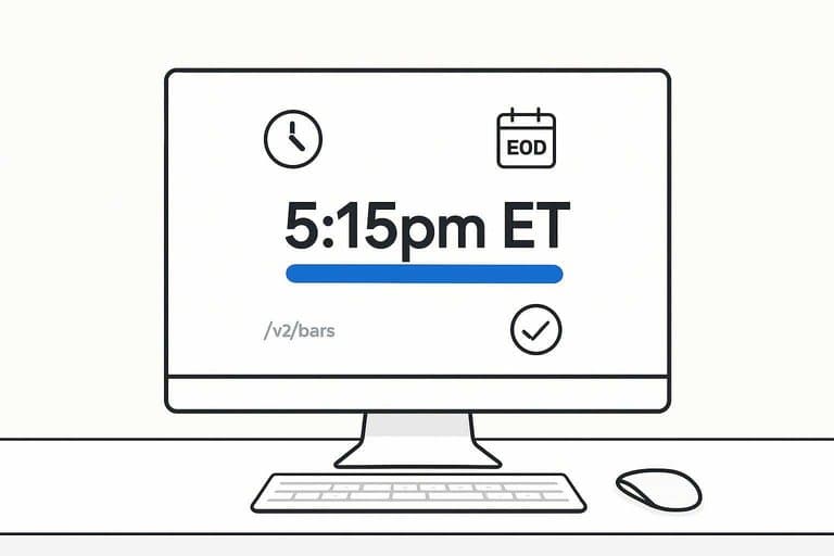
You want post-close bars that are reliable, repeatable, and cheap to re-run. Treat ingestion like a batch job with contracts, not a one-off script. For example, if your provider says “EOD is finalized at 5:15pm ET,” bake that into scheduling and alerts.
API client setup
You need a client that behaves under load and fails predictably. Configure it once, then reuse it across downloaders and backfills.
- Load API key from env or secret manager, never from code.
- Set a base URL and a versioned path, like
/v2/bars. - Add retries with exponential backoff plus jitter for 429 and 5xx.
- Send a clear
User-Agent, likeeod-dashboard/1.0 (email@domain). - Set strict timeouts and a max page limit to avoid runaway loops.
When your client is boring, your pipeline becomes debuggable.
If you’re using Polygon, their aggregates and grouped daily concepts are worth reading to align on endpoint behavior and terminology.
Idempotent loads
You will re-run ingestion. Make “re-run” a safe operation, not a scary one.
Use an upsert keyed by (symbol, trade_date) and treat that as immutable identity. Dedupe by keeping the newest provider timestamp, or the last ingested record, when duplicates appear. When revisions arrive, overwrite only changed fields and store a source_updated_at so you can explain diffs later.
If revisions happen often, add a small “reconcile window” to re-fetch recent dates.
Backfill strategy
Backfills are where rate limits and idempotency get tested. Pick a mode per use case, not a single forever option.
- Full history from IPO date
- Rolling N days, like last 30
- Gap-fill missing dates per symbol
- Symbol-only backfill after new listings
- Provider-change replay for parity checks
Choose the cheapest mode that still fixes the data you actually use.
Quality checks
Bad bars look “valid” until they break comparisons. Catch them at ingest, not in the dashboard.
Validate that weekend and exchange holidays have no bars, unless your asset trades 24/7. Flag zero volume or zero trades for equities, since it often signals a provider glitch. Detect outlier moves using a simple rule, like abs(return) > 25%, and queue them for review. Confirm timezone and date alignment, so a bar labeled “2026-05-17” is your intended session, not UTC spillover.
If you can’t trust the dates, you can’t trust any ranking or chart.
Use the NYSE hours and calendars page as the authoritative reference for core session timing and holiday rules.
Compute Indicators
You can’t compare post-close moves without consistent features. Compute the same indicators for every symbol, then store them once. Think “one close, one truth,” like a daily fact table.
Indicator formulas
You want indicators that are stable, common, and easy to sanity-check. If you can’t explain it in one line, it won’t survive production.
- SMA(20/50/200): rolling mean of Close
- RSI(14): Wilder smoothed gains vs losses
- ATR(14): Wilder true range average
- Cum return: cumprod(1 + daily_return)
- Relative: cum_return / benchmark_cum_return
Relative series are the dashboard’s backbone, because they normalize noise into a single story.
Batch job steps
Your batch job should be boring and repeatable. One run per trading day, after the close.
- Read daily OHLCV bars for all symbols and the benchmark.
- Compute indicators per symbol, aligned on the same calendar.
- Write results into indicators_daily with date and symbol keys.
- Upsert benchmark series used for relative calculations.
- Mark job completion with run_id, date, and row counts.
Make completion idempotent, or you’ll re-run yourself into bad data.
Performance tuning
Daily runs should feel instant, even with thousands of symbols. Use vectorized pandas operations and avoid per-row Python loops.
Recompute only what changed by using rolling windows. For example, for SMA(200) you only need the last 200 bars plus today.
Index for how you query and write. A composite (date, symbol) index makes upserts and dashboard reads predictable.
Speed is a data-quality feature, because slow jobs get skipped and skipped jobs create gaps.
Ship a Reliable First Version This Week
- Lock the contract: define your post-close cutoff time, ticker universe, required comparison metrics, and a single daily update cadence.
- Stand up the core stack: data provider + storage schema + dashboard framework, then add a scheduler only after a manual run works end-to-end.
- Implement ingestion with safeguards: idempotent loads, a clear backfill procedure, and basic quality checks (missing days, zero volume, outlier gaps).
- Batch indicators last: compute formulas off adjusted prices, tune the job for your universe size, and publish only validated outputs to the dashboard tables.
Frequently Asked Questions
What should a post-close stocks comparison dashboard include beyond daily OHLCV data?
Include total return (with splits/dividends), relative performance vs a benchmark (e.g., SPY), rolling correlation/beta, volatility (20D/60D), and drawdown so comparisons reflect risk and not just price changes.
How do I measure whether my stocks comparison dashboard is accurate each day?
Validate by cross-checking a random sample of symbols against a second data source (e.g., Polygon vs. Stooq/Yahoo) and run automated checks for missing bars, duplicate dates, abnormal gaps, and indicator recomputation parity.
How long does it take to build a working stocks comparison dashboard for 50–200 tickers?
A basic MVP usually takes 1–3 days, while a production-ready version with monitoring, backfills, and validation typically takes 1–2 weeks, depending on data provider quirks and indicator scope.
Can I do stocks comparison without paying for a market data API?
Yes—Stooq and Yahoo-style sources can work for end-of-day comparisons, but expect occasional gaps, adjusted-price inconsistencies, and weaker SLAs compared to paid providers like Polygon, Tiingo, or EODHD.
How often should I refresh a post-close stocks comparison dashboard, and when is the best time to run it?
Refresh once per trading day, typically 30–90 minutes after the market close to allow providers to finalize adjusted data; rerun a nightly backfill job for the last 5–10 days to catch late corrections.
Compare Leaders After the Close
Building a post-close stocks comparison dashboard is powerful, but maintaining clean inputs and consistent indicators across thousands of tickers can drain your nightly bandwidth.
Open Swing Trading delivers daily-after-close relative strength rankings, breadth, and sector/theme rotation context across ~5,000 stocks—so your dashboard starts with a curated shortlist. Get 7-day free access with no credit card.