A 15-Minute Swing Trading Routine Using the Stock Heat Map Today
Transform your swing trading with a daily 15-minute routine. Learn to read the stock heat map today, spot market leaders, and build a high-momentum watchlist.
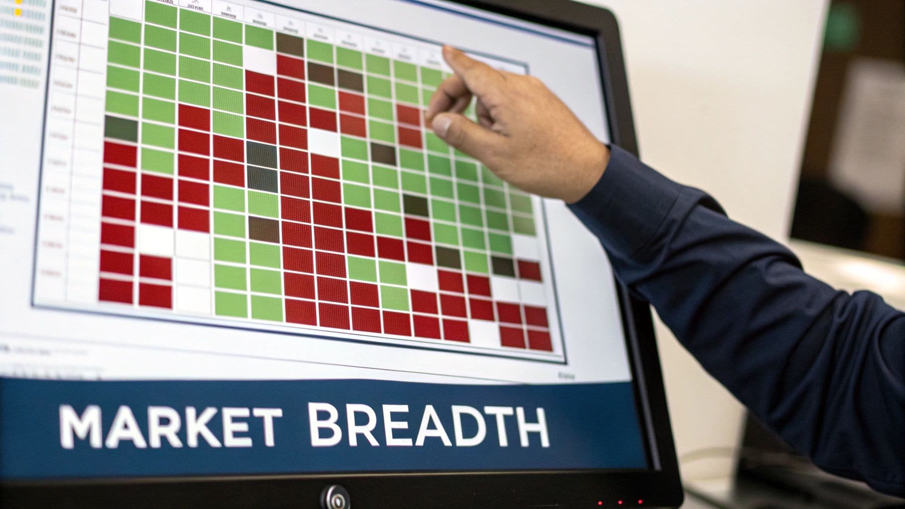
A stock heat map is one of the most powerful tools a trader has, giving you an immediate visual feel for the market's pulse. It’s simple, really. Green boxes show what's working, and red boxes show what's not. This color-coded grid lets you instantly see which sectors and individual stocks are attracting money and which ones are getting sold off, cutting through the noise of complex data. This direct insight is a core benefit for swing traders, allowing for quick, high-conviction decisions.
Your 15-Minute Routine for Daily Market Analysis
You don't need hours of pre-market analysis to find your edge. For a swing trader in 2026, efficiency is everything. I've honed a disciplined, 15-minute routine built around the daily stock heat map that gives me all the context I need to build a high-probability watchlist. This isn't about chasing the "stock of the day"; it's a systematic way to sync your trades with what the market is actually doing.
This process turns that sea of green and red into real, actionable intelligence. The goal is to get past just seeing what’s up or down and start digging into the why. The entire routine breaks down into three quick phases: a broad market scan, a look at sector flows, and finally, isolating the true leaders.
This workflow is all about starting big and narrowing your focus until you have a handful of prime candidates for a trade.
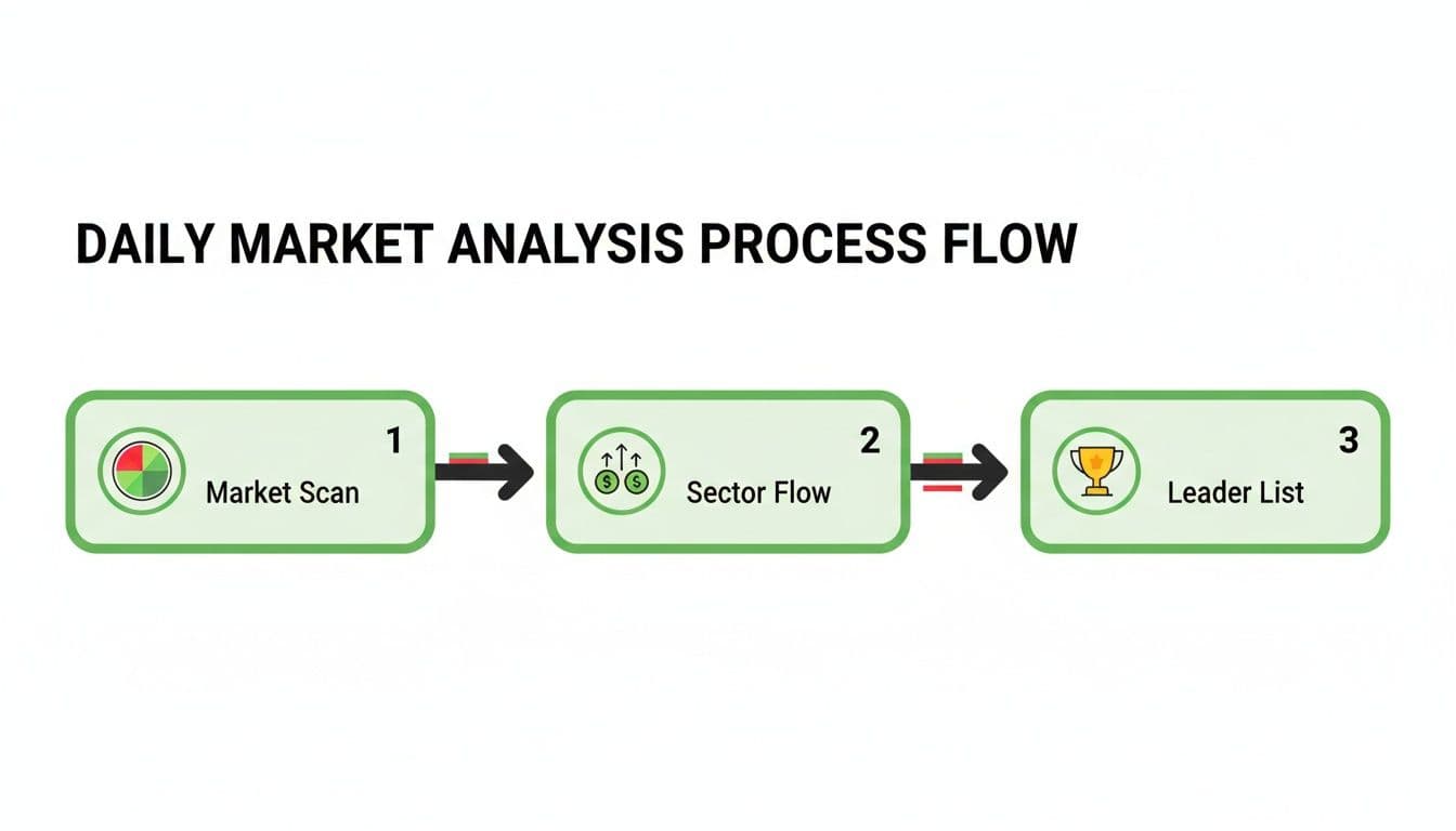
As the chart shows, you start with the 30,000-foot view of the market before zooming in on specific stocks. It's a funnel, not a firehose.
Reading the Flow of Capital
At its core, a heat map is your best real-time indicator of capital rotation—the movement of big, institutional money. When you see big, bright green blocks clustered together, you know exactly where the money is flowing. That insight is the foundation for any swing trader who wants to ride the waves of momentum instead of getting crushed by them.
For instance, looking at today's S&P 500 stock market heat map, the industrials sector is practically glowing. You can't miss it. GE Vernova (GEV) is ripping higher by 6.12%, and Eaton (ETN) is up a solid 3.09%. That's a clear signal of relative strength.
On the flip side, you see a pocket of deep red in healthcare. Giants like Humana (HUM) are down 3.76%, Centene (CNC) has fallen 3.22%, and CVS Health (CVS) has shed 3.39%. This red zone is a warning sign, telling you capital is likely leaving that sector. You can dig deeper into these kinds of dynamics on a site like StockAnalysis.com.
The takeaway for a swing trader is simple: Stop fighting the tape. Start trading with the current. By focusing on sectors getting that institutional bid, you put yourself in the path of least resistance, where follow-through is much more likely. This is a key benefit of swing trading—aligning with powerful trends for higher-probability outcomes.
To help structure this process, here's a quick look at the daily workflow I follow.
Daily Heat Map Analysis Workflow at a Glance
This table breaks down the entire 15-minute routine, showing how each phase builds on the last to create a focused, high-potential watchlist.
| Phase | Objective | Key Focus Area | Time Allotment |
|---|---|---|---|
| Market Scan | Get a quick read on overall market health. | Major indices (S&P 500, Nasdaq), risk-on vs. risk-off sentiment. | 2–3 minutes |
| Sector Flow | Identify the strongest and weakest sectors. | Look for clusters of green (strength) or red (weakness). | 5–7 minutes |
| Leader List | Isolate the top stocks within the strongest sectors. | Find stocks showing high relative strength and clean chart patterns. | 5 minutes |
This simple table turns a complex task into a manageable, repeatable habit that consistently surfaces high-quality trading ideas.
Adopting this kind of routine gives you a massive advantage.
- It’s Fast: It boils hours of work down into a repeatable 15-minute habit.
- It’s Clear: You cut through the noise and focus only on the stocks with real institutional backing.
- It’s Disciplined: Having a framework kills the temptation to make impulsive, emotional trades.
Ultimately, mastering this quick-scan technique on platforms like OpenSwingTrading lets you build a powerful watchlist based on strength you can see, not on a gut feeling. It's a professional approach designed to give you a real edge before the opening bell even rings.
Reading Market Health and Breadth in Minutes
Before you even think about hunting for individual stocks, your first move should always be a quick, top-down look at the entire market. I like to think of the stock heat map today as a satellite weather image for the trading day. It tells you in a single glance whether the conditions are sunny and clear (risk-on) or stormy and dangerous (risk-off).
The real skill here isn't just counting the green versus red tiles. The true insight comes from the intensity and distribution of those colors. Is all the green packed into a few mega-cap names, artificially propping up the major indexes while everything else is bleeding out? Or are we seeing broad, healthy participation with vibrant green splashed across multiple key sectors?
This is how you start to build an intuitive feel for market breadth, and it takes just a few seconds.

Spotting Early Warning Signs
A healthy market really does look like a garden in full bloom—you see strength popping up all over the place. On the flip side, a major red flag is when you start seeing large, dark red blocks dominate important sectors like Technology, Financials, or Consumer Discretionary. Even if the S&P 500 is trading flat for the day, that kind of picture screams underlying weakness.
Let's say in 2026, a quick scan of the heat map shows the major indices barely budging, but the entire semiconductor group within the technology sector is deep red. That’s your immediate warning. It tells you that while the market's generals (the mega-caps) might be holding the line, the soldiers are in full retreat.
For swing traders, this context is everything. Piling into a new long position when market breadth is collapsing is like trying to swim upstream against a powerful current. You’re fighting a tide that can sink even the best-looking chart setup. This risk management is a core benefit of swing trading—avoiding trades when conditions are unfavorable.
Interpreting Sector Imbalances
Drilling down a bit deeper, the heat map reveals stark imbalances in sector performance. For instance, on any given day, you might see the tech and communications sectors lagging, with a few well-known names getting hit hard.
Statistically, when 20-30% of S&P sectors are showing average declines of over 2%, it points to narrowing breadth—a classic pre-correction signal. But it's rarely a uniform washout. At the same time, you might see industrials posting 3%+ gains. This shows that money isn't leaving the market entirely; it's rotating. For more on this, you can learn about analyzing stock correlations with heat maps on twelvedata.com.
This ability to take the market’s temperature in under five minutes is the foundational first step of my daily routine. It ensures my strategy for the day is aligned with reality, not just wishful thinking, and that dramatically improves my odds. Once I have this bird's-eye view, I can confidently move on to tracking exactly where the money is flowing.
Following Smart Money with Sector and Industry Flows
Once you have a good read on the market's overall health, it's time to follow the money. This is where a stock heat map today really shines—it's the best visual tool out there for tracking capital rotation in real time. We’re moving from the 30,000-foot view down to finding the specific neighborhoods where the action is happening.
Your eyes will naturally be drawn to the biggest, brightest blocks of color. A sea of green in one corner while another sector is bleeding red isn't random noise. It's a story. That story is about where the big institutional players are placing their bets, and our job as swing traders is to simply ride their coattails.
Reading the Rotations: Cyclical vs. Defensive
Capital flow generally moves between two modes: aggressive or defensive. Being able to spot the difference is a critical skill, and the heat map makes it almost laughably easy.
- Aggressive Flows (Risk-On): When you see vibrant green lighting up sectors like Technology, Industrials, and Consumer Discretionary, it's a clear signal. Institutions are bullish on economic growth and aren't afraid to take risks.
- Defensive Flows (Risk-Off): On the flip side, if the only real green on the map is in Utilities, Consumer Staples, and Healthcare, it screams caution. Money is fleeing to safer, more stable corners of the market that don't rely on a booming economy.
This single observation sets your bias for the day. Trying to force long trades in a weak sector while institutions are selling is like swimming upstream. You want to align yourself with these powerful macro flows, putting the institutional weight at your back. That’s a fundamental edge for swing trading in 2026.
An Example of Sector Strength in Action
Let’s look at a global stock heat map today for a real-world example. On days where we see a clear rotation into cyclical stocks from the S&P 500, U.S. industrials might be a major standout. You could see names like GE Vernova (GEV) up 6.12% and Eaton (ETN) gaining 3.09%. This isn't just one or two stocks doing well; it's a visual confirmation of money flooding the entire sector.
For a trader, this visual clue massively speeds up the process. It confirms a "risk-on" mood and points you exactly where to start digging. You can see more on how traders use this to accelerate their workflow on YouTube.
By identifying the strongest sector—in this case, Industrials—you've just filtered the market from thousands of stocks down to a few dozen high-potential names. This is the core of the OpenSwingTrading method. It's about efficiency and avoiding the classic "analysis paralysis."
This habit of tracking sector flows is more than just finding what's hot. It's about building the discipline to only play in areas of the market that have a strong institutional tailwind. It's a simple, powerful filter that stacks the odds in your favor for finding stocks with the momentum needed for a solid swing trade.
Isolating High-Relative-Strength Market Leaders
Alright, so you’ve spotted the market's strongest sectors. Now comes the final—and most important—step: drilling down to find the true alpha performers inside them.
Seeing a sea of green in a sector is a good start, but as swing traders, we’re hunting for the stocks leading the charge, not the ones just getting pulled along for the ride. This is how you separate the good from the great.
A stock heat map today makes this initial discovery work incredibly fast. Your eyes are naturally drawn to the brightest green tiles, the stocks posting the biggest percentage gains. These are your first-pass candidates, the names outperforming not just the broader market but their direct competitors.
This is a critical distinction. It’s one thing to own a stock in a hot sector; it’s a completely different ballgame to own the leading stock in that sector. Leaders attract the lion's share of attention and capital, which almost always translates into more powerful, sustained moves. This focus is what dramatically improves your trade selection.
From Visual Cues to Data-Driven Confirmation
The heat map gives you that initial visual spark, but relying on color alone is a rookie mistake. This is where you need to get serious and quantify what your eyes are telling you with objective metrics, something we live and breathe at OpenSwingTrading.
Let's walk through a real-world scenario from 2026. You pull up the map and the Industrials sector is lit up. One block in particular, GE Vernova (GEV), is screaming at you—it's up a powerful 6% on the day. That’s your visual signal.
This is the exact moment where most traders stop. They see a hot stock and feel the urge to jump in. A professional, however, takes one more crucial step: they cross-reference that visual leader with hard data. This discipline is what allows swing traders to capture multi-day moves instead of getting caught in one-day wonders.
You take that ticker, GEV, and plug it into a platform that ranks stocks by volatility-adjusted relative strength. Does the data confirm it’s a top-tier performer not just today, but over a meaningful lookback period? This simple validation step is your defense against chasing a stock that’s just having a fleeting, news-driven pop.
Building a High-Conviction Shortlist
This two-step process—visual discovery followed by data validation—is the secret to building a watchlist you can actually have confidence in. It ensures every single stock on your list has passed two critical tests:
- Sector Strength: It lives in a sector getting institutional love, giving your trade a powerful tailwind.
- Individual Leadership: It's a confirmed outperformer within that strong sector, stacking the odds of continued momentum in your favor.
When you follow this method, you stop guessing and start operating with precision. You're no longer just plucking a green stock from a green sector. You are systematically isolating the market's strongest names, which is the entire point of a disciplined swing trading strategy. This is how you go from just watching the market to actively finding its best opportunities.
Building Your 5–15 Minute Swing Trade Watchlist

Alright, this is where the rubber meets the road. You’ve taken the market’s temperature, tracked the institutional money flowing through sectors, and spotted the alpha dogs. Now it's time to translate that hard work into a razor-sharp, high-conviction watchlist.
We’re not building a laundry list of every stock that looks "interesting." The goal here is a curated, sniper-like list of your top 3–5 candidates. That's it.
This final five-minute sprint is about creating a list where every single ticker has earned its spot with data. It’s a disciplined workflow that keeps you from chasing noise and making impulsive bets—a core philosophy for any serious swing trader. You walk away with a clear plan before the opening bell even rings.
From Heat Map Insight to Watchlist Candidate
It's tempting to see a sea of green in a strong sector and feel overwhelmed. This is where a trader’s real edge is forged—in the discipline of selection. It’s your job to be ruthless.
Let’s say the Industrials sector is lit up like a Christmas tree. Great. But out of those ten green stocks, maybe only three are up more than 4% on unusually high volume. Those are your real candidates. The rest are just noise.
This distillation process is what separates proactive, professional trading from simply reacting to whatever flashes across your screen. At OpenSwingTrading, we preach this constantly: focus on the outliers.
The whole point is to avoid juggling a dozen mediocre ideas. You want to pour all your energy into a handful of A+ setups where the data suggests the odds are already tilted in your favor.
A scattered watchlist leads to scattered results. Narrowing your focus to only the highest-conviction leaders is a commitment to quality over quantity. This discipline is your greatest edge in the market.
Many traders see a strong sector on a heat map and just start grabbing tickers. A data-driven approach, however, demands a more systematic process to convert that visual cue into a high-probability trade idea. Here’s a quick comparison of how that plays out.
From Heat Map Insight to Watchlist Candidate
| Analysis Step | Typical Approach | Data-Driven Swing Trader Approach (OpenSwingTrading Method) |
|---|---|---|
| Sector Signal | Sees Industrials are green and starts looking at popular names like CAT or DE. | Confirms Industrials have the highest relative strength and volume flow. |
| Stock Selection | Adds 5-6 industrial stocks that are up on the day to a "maybe" list. | Scans for the top 2-3 stocks within Industrials showing the greatest outperformance (e.g., up 4% vs. sector up 1.5%). |
| Thesis Formation | "Industrials are hot, so I'll buy this one." | "GEV is the top relative strength leader in the strongest sector, breaking out on high volume." |
| Watchlist Entry | Jots down "GEV" on a notepad. | Logs the ticker, thesis, and the key breakout level to watch for a clean entry trigger. |
This structured approach ensures that by the time a stock hits your final watchlist, it's not just a hunch—it's a vetted candidate backed by a clear, logical thesis.
Logging and Prepping Your Candidates
Once you have that handful of tickers, the last step is to get them organized for action. This might sound simple, but it’s a non-negotiable part of the routine that solidifies your plan and prevents fumbling when it's time to execute.
Here’s a quick and effective way to structure your list:
- Ticker: The stock symbol (e.g., GEV).
- Thesis: A one-sentence "why." Example: "Top relative strength leader in the strong Industrials sector."
- Key Level: The breakout price, support area, or specific price action you're waiting for.
With this log, you can immediately pull these tickers up in your charting software like TradingView. Now the real technical work begins: drawing your levels, identifying precise entry triggers, and mapping out your preliminary stop-loss and profit targets.
Just like that, you've converted the big-picture visual data from the heat map into a concrete, actionable trade plan. You’re ready.
Answering Your Top Questions About Stock Heat Maps
Whenever you add a new tool to your trading arsenal, questions are bound to pop up. That's a good thing—it means you're thinking critically. Let's walk through some of the most common questions I hear from traders trying to use a stock heat map today for their 2026 swing trading routine.
Getting clear on these points will help you sidestep common mistakes and build real confidence in what the map is telling you.
How Can I Use a Heat Map to Spot a Market Reversal?
A heat map is fantastic for catching the very first signs of a trend getting tired. You're looking for widespread weakness that crops up in the exact sectors that have been carrying the market.
For instance, let’s say the Tech sector has been a sea of bright green for weeks. Then one afternoon, you see several of the biggest names—think NVDA or AAPL—flashing red, down 3-4%. That’s not just noise; it’s a huge red flag. It tells you that profit-taking is finally hitting the market's strongest pillars.
Another dead giveaway is a "defensive rotation." You can literally see the money moving. Aggressive growth areas will be turning deep red, while quiet sectors like Utilities or Consumer Staples suddenly pop up as islands of green. That’s the market screaming "risk-off."
A true market reversal almost never happens out of the blue. It starts with cracks in the leadership. When the market's generals start stumbling, it's a clear warning that the rest of the troops might be next.
What’s the Difference Between a Real-Time and an End-of-Day Heat Map?
This is a crucial distinction, especially for a swing trader. Watching a real-time map flicker all day can be mesmerizing, but it’s also packed with intraday noise that can trick you into making emotional, knee-jerk decisions.
For our purposes, the end-of-day heat map is where the real value is. It gives you the final, settled verdict on where institutional money actually ended up. All the intraday fakeouts and head-fakes are gone. What you're left with is a clear picture of the day's true conviction.
Your evening analysis and watchlist building should always be based on the end-of-day map. It’s the only way to reliably spot the multi-day trends that swing trading is all about.
How Do I Stop Myself From Chasing the Brightest Green Stocks?
This is probably the most important habit to build. You can't just buy the brightest green box on the screen. The heat map is a discovery tool, not a buy signal.
Think about it: that stock screaming higher by 15% could be running on a one-off news event or a violent short squeeze. It might look great today, but it's often a prime candidate to give all those gains back tomorrow.
The secret is to always pair what you see on the map with solid technical analysis on a chart. A genuine leader worth your capital will have both:
- Visual Strength: It’s one of the standout green squares on the map.
- Technical Confirmation: It's also breaking out of a clean chart pattern (like a high-tight flag or a multi-week base) on heavy volume.
This two-step check is your filter. It’s non-negotiable. It makes sure you aren't just chasing performance but are aligning yourself with stocks that have a technical foundation for a sustained move.
At OpenSwingTrading, we build this exact workflow into our platform. We help you go from just seeing the colors to confirming true leadership with objective relative strength data. Start your 7-day free trial at openswingtrading.com and see how quickly you can build a high-conviction watchlist.