Master the Stock Market Heat Map for Smarter Swing Trading
Unlock the power of a stock market heat map. This guide shows swing traders how to visually spot sector trends and find high-momentum stocks fast.
A stock market heat map is one of those rare tools that really does turn a mountain of complex data into something you can understand in seconds. Imagine a mosaic of color-coded boxes. The size of each box tells you how big the company is (its market cap), while the color—usually bright green for up and deep red for down—shows you its stock price performance at a glance.
It’s an elegant way to transform raw financial numbers into a clear, intuitive picture of the entire market.
Reading the Entire Market in Under Five Minutes
As a discretionary swing trader in 2026, your biggest enemy is noise. You’re bombarded with economic news, social media hype, and an endless sea of stock charts. The real challenge is showing up each morning and quickly figuring out one thing: where is the money actually flowing today?
This is where a good heat map becomes your secret weapon. Think of it as your entire morning market briefing, but packed into a single, visual snapshot. It’s a shortcut that tells you the market's mood, which sectors are hot, and which are getting hammered. This efficiency is a core benefit of open swing trading: using powerful tools to quickly identify high-probability opportunities without wasting hours on manual analysis.
See What Matters Most Instantly
Instead of drowning in spreadsheets or scrolling through news feeds, a heat map gives you a bird's-eye view of the market landscape. This kind of context is priceless because it helps you absorb critical information almost instantly—information that might otherwise take hours to piece together. For a swing trader, that speed is a serious edge.
In just a few minutes, you can get a solid read on:
- Overall Market Health: Is the map a sea of vibrant green, signaling a strong bull run? Or is it a bloodbath of red, pointing to broad market weakness?
- Sector Leadership and Laggards: Are tech and finance stocks glowing green while energy and utilities are fading to red? This instantly shows you where the big money is rotating.
- Pockets of Strength or Weakness: Even on a choppy, mixed day, a heat map helps you spot specific industries or sub-sectors that are bucking the trend.
A heat map doesn’t just show you what individual stocks are doing; it tells the story of the market's internal dynamics. You see the relationships between sectors, industries, and the major players all in real-time.
This immediate context is the bedrock of a smart swing trading strategy. It stops you from swimming against the current. Once you have this macro view, tools like OpenSwingTrading become even more powerful, helping you drill down to find the strongest stocks within those leading sectors.
By starting your day with a heat map, you’re making sure your energy is focused where it counts—on the parts of the market with the highest probability of success. You're aligning your trades with the market’s real momentum from the opening bell.
What Is a Stock Market Heat Map and How Does It Work?
Ever tried to make sense of the market by staring at a long list of ticker symbols and price changes? It’s like trying to understand a city by reading a phone book. A stock market heat map throws that approach out the window and gives you an aerial view instead.
Think of it this way: each stock is a building in the city. The bigger the company’s market capitalization, the bigger its building. So, giants like Apple (AAPL) or NVIDIA (NVDA) look like massive skyscrapers, while smaller companies are just regular office buildings. You can instantly see who the big players are.
Then, there’s the color. Every building is painted either green or red. A bright, vibrant green means the stock had a great day, while a deep, angry red signals a steep drop. Lighter, more muted shades show smaller price movements. Suddenly, you're not just looking at data; you're seeing the entire market's mood in a single glance.
The Three Core Components of a Heat Map
At its heart, a stock market heat map is surprisingly simple. It’s built on just three key elements that, when combined, give you a powerful, at-a-glance analysis. Getting these fundamentals down is the first step to making the tool a core part of your swing trading routine in 2026.
Here’s the breakdown:
- Rectangles (The Stocks): Each colored tile on the map is a single, publicly traded company.
- Size (The Market Cap): The size of that tile is directly proportional to the company's market value. This tells you how much influence it has on the market.
- Color (The Performance): The color and its intensity show you the stock's price performance over a set time, usually the current trading day.
But these tiles aren't just scattered randomly. They’re intelligently grouped into neighborhoods representing their industries (like Software or Semiconductors), which are then clustered into larger districts for their market sectors (like Technology or Healthcare). This organization is the secret sauce.
It lets you start with a 30,000-foot view to see which sectors are hot or cold, then zoom in to find the industries and individual stocks leading the charge.
This is how a flood of raw data gets turned into a clear story about where the money is flowing.
This visual shows exactly where a heat map fits into a trader's process, acting as a powerful filter that helps pinpoint real opportunities from all the noise.
As you can see, it’s about turning a sea of information into a handful of solid trade ideas you can then analyze further in a tool like TradingView.
From 19th-Century Statistics to Modern Trading
Heat maps feel incredibly modern, but the idea behind them has been around for over a century. The concept actually dates back to 1873, when a statistician named Louis‐Émile Loua used colored grids to visualize social statistics in Paris. It wasn't until the early 1990s that this idea was applied to financial markets.
Software designer Cormac Kinney is credited with creating one of the first tools to display real-time financial data this way, even trademarking the term "heatmap." This innovation completely changed the game. What once took hours of sifting through quote pages can now be understood on a single screen.
For today's swing traders, including those on platforms like OpenSwingTrading, that 30-year evolution means you can get a solid read on sector strength and market leadership in just 5–15 minutes a day. If you're curious, you can explore more about the history and application of heat maps to see just how far these tools have come.
How to Spot Actionable Trends with a Heat Map
Alright, so you know what a heat map is and how it’s built. Let's get to the good stuff: moving from theory to actual trading. A heat map isn't just a pretty dashboard; it’s a tool for turning visual patterns into real-world trading ideas. For any discretionary swing trader, learning to read these patterns is like learning to read the market’s body language.
This is the skill that separates traders who just react to news from those who can actually anticipate where the big money is flowing next. By recognizing a few key visual cues, you can give yourself a serious edge. Let's break down four of the most important patterns you need to master.
Identifying Sector Rotation in Real Time
One of the most powerful things a heat map does is show you sector rotation as it’s happening. This is simply the large-scale movement of capital from one market sector to another—for instance, when you see money pouring out of Technology and into Financials or Energy.
A heat map makes this dynamic impossible to miss. Entire blocks will glow bright green, signaling intense buying pressure, while other blocks bleed a deep, angry red. This isn't just random market noise; it's a visual billboard showing you exactly where institutional money is placing its bets for the coming days and weeks.
As a swing trader, your job is to align your trades with this flow. You want to fish where the fish are biting, right? The heat map instantly points you to the right ponds, highlighting the sectors with the highest probability of success. This is an actionable insight that lets you focus capital where momentum is building, a key tenet of swing trading.
Judging the Health of Market Breadth
Market breadth is a vital sign of the market's overall health. It answers a critical question: is this rally being propped up by a few mega-cap stocks, or is the strength broad-based and supported by the majority of companies?
A stock market heat map gives you the clearest picture of breadth you’ll ever find.
- Healthy Rally: You'll see a sea of green tiles spreading across multiple sectors and industries. The green rectangles will be a mix of large and small, indicating widespread participation. This is the sign of a robust, sustainable trend.
- Fragile Rally: You'll see a few enormous green tiles (think NVDA or MSFT) surrounded by a sea of pale green, flat, or red tiles. This is a huge red flag. It signals a weak, narrow rally that could fall apart the second those few leaders stumble.
One of the most valuable things a heat map does is compress all this complex data into a single, immediate snapshot. On any given day, the S&P 500’s 11 sectors can have a performance gap of more than 300–500 basis points between the best and worst groups, even when the index itself barely budges by ±1%. When breadth is strong and 70–80% of S&P 500 stocks are green, historical data shows that forward returns tend to be much stronger. Compare that to periods where fewer than 40% of stocks are participating.
For traders, especially those using platforms like OpenSwingTrading, this visual context is crucial for avoiding big bets in a market where only a handful of names are doing the heavy lifting. You can see these dynamics play out in real-time on heat maps from sites like StockAnalysis.com.
Finding Pockets of Strength in Weak Markets
Even on ugly days when the entire market is down or chopping sideways, there are almost always hidden gems. I'm talking about individual industries or specific stocks that are completely bucking the trend. These pockets of strength are often the highest-probability swing trades because they're showing true relative strength against a weak backdrop.
Picture this: the S&P 500 heat map is a sea of red, but you notice the entire "Semiconductors" block is lit up bright green. That’s a massive clue. It’s telling you that despite the widespread selling, big buyers are aggressively scooping up semiconductor stocks.
These pockets of strength act as a bright flare in a dark room. The heat map guides your eyes directly to them, allowing you to focus your research and charting efforts where they are most likely to pay off.
This is where a visual tool really shines. Instead of grinding through hundreds of stock charts, the heat map does the initial work for you, pointing you straight to the small corners of the market that are outperforming everything else. This is exactly the kind of edge that platforms like OpenSwingTrading help you act on.
Confirming Trends or Spotting Reversals
Finally, a stock market heat map is an incredible tool for confirmation. Let's say you see a stock breaking out on your TradingView chart. A quick glance at the heat map can tell you if its industry and sector are also strong. When everything aligns, you have a powerful tailwind for your trade.
On the flip side, it can warn you of a potential reversal. If a sector has been glowing green for days but suddenly starts looking pale or flipping to red, that could be an early sign that momentum is dying. This gives you a chance to tighten your stops or take some profits before the trend completely rolls over. For any swing trader, this quick visual check adds a critical layer of confirmation to your daily process.
The table below summarizes these key visual cues and what they mean for your trading decisions.
Interpreting Heat Map Patterns for Swing Trading
| Visual Pattern | What It Means | Actionable Swing Trading Insight |
|---|---|---|
| A Single Sector Lights Up Green | Institutional capital is rotating into a specific area of the market. | Focus your search for long setups within that strong sector. Ride the new wave of money flow. |
| A Sea of Green Across All Sectors | The market is experiencing a broad, healthy rally with widespread participation. | High-conviction environment for long trades. Look for strong stocks in strong sectors. |
| A Few Mega-Caps Green, Everything Else Red | The rally is weak and narrow, driven by a handful of giants. Breadth is poor. | Be cautious with new long positions. The market is fragile and could reverse easily. |
| An Industry Block Glows Green in a Red Market | A "pocket of strength" shows extreme relative strength against the overall trend. | These are prime A+ swing trading candidates. Investigate the stocks in that industry immediately. |
| A Hot Sector Starts to Fade from Bright Green to Pale | Momentum is weakening, and buying pressure is drying up. The trend may be ending. | Time to tighten stop-losses on existing positions in that sector or consider taking profits. |
By incorporating these pattern recognition skills into your daily routine, the heat map becomes more than just data—it becomes a strategic guide.
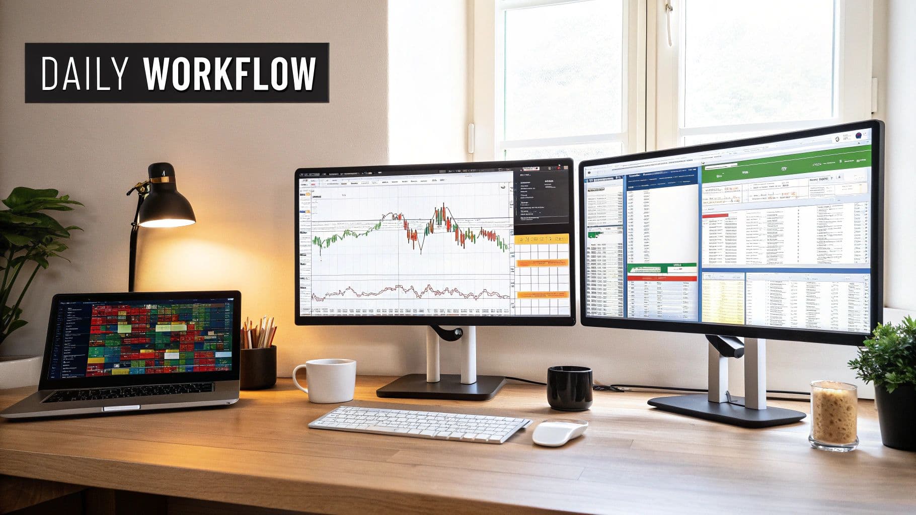
Building Your Daily Swing Trading Workflow
Knowing how to read a heat map is one thing. Actually using it to find profitable trade ideas is a whole different ballgame. For a swing trader, especially in 2026, your time is your most valuable asset. You need a rock-solid routine that can take you from a high-level market snapshot to a shortlist of A+ trade candidates, and it has to be fast.
What you need is a repeatable, daily workflow that takes no more than 15 minutes after the market closes. Think of it as your end-of-day ritual, a simple three-step process designed to connect the dots from broad market dynamics to specific, actionable setups. This efficiency is a hallmark of open swing trading, allowing you to consistently find quality setups without being chained to your screen.
Step 1: The Post-Market Macro View
Your routine kicks off the second the closing bell rings. Before you even glance at a single stock chart, you need to get the lay of the land. This step should be quick—no more than one minute.
Pull up a daily stock market heat map. You can find free ones on sites like Finviz or even within TradingView. At this stage, you have one simple goal: answer two critical questions instantly.
- Where did the money go today? Pinpoint the one or two sectors glowing brightest green. That’s your starting point.
- How healthy was the market, really? Get a feel for the overall market breadth. Was it a genuine sea of green, a bloodbath of red, or just a mixed bag held up by a handful of mega-caps?
This one-minute checkup sets the tone for everything else. It gives you that crucial top-down perspective, ensuring you aren’t wasting energy hunting for long setups on a day when institutions were clearly hitting the sell button.
Step 2: Pinpoint Strength with OpenSwingTrading
Okay, the heat map told you where to look. Now it's time to figure out what to trade. This is the heart of the workflow and where you’ll spend about ten minutes. We're moving from a strong sector to a focused list of its most powerful stocks.
This is exactly where a specialized platform like OpenSwingTrading shines. A heat map shows you that the "Technology" sector was strong, but it doesn't tell you which tech stocks are the true leaders. For that, you need an objective, data-driven tool to separate the wheat from the chaff.
Here's how to weave it into your process:
- Confirm the Theme: Log into OpenSwingTrading and head straight to the sector and industry analytics. You're looking for confirmation that the themes you spotted on the heat map are backed by hard data.
- Filter for Leaders: Use the platform’s rankings to immediately identify the top-ranked stocks within those hot sectors. These are the names outperforming not just the broader market, but their direct competitors.
- Build a Preliminary List: Cherry-pick the top 3-5 candidates that stand out. These are the stocks attracting real institutional money, giving your potential trades a powerful tailwind.
This step acts as the bridge between the big-picture context and your individual stock selection. The heat map gives you the directional bias, and OpenSwingTrading serves up the objective, ranked candidates ready for the final cut.
Following this ensures your watchlist is only populated with Grade-A opportunities. You're systematically filtering out the laggards and focusing your capital where it has the best chance to grow. It’s a classic swing trading advantage—letting the data guide you to where the odds are stacked in your favor.
Step 3: Chart Analysis and Finalizing the Watchlist
You've got your shortlist of elite candidates from OpenSwingTrading, so now it's time to bring it home. This final step should only take about four minutes. It’s where you switch from the "what" back to the "when," firing up your charts to analyze the price action.
For each stock on your list, you're looking for one thing: a clean technical pattern. Is the stock setting up a high-tight flag? Is it breaking out from a solid base or pulling back neatly to a key moving average? You’re hunting for a clear, low-risk entry point where you can precisely define your trade—your entry, stop-loss, and initial target.
The stocks that check both boxes—strong data-driven ranking and a clean technical setup—are the ones that make it onto your final watchlist for tomorrow. If a chart looks choppy, messy, or lacks a clear entry signal, it gets cut. No exceptions, no matter how strong its ranking was.
This disciplined, three-part workflow creates an incredible synergy:
- The Heat Map (The "Why"): Gives you the market context and tells you why a certain area of the market is hot.
- OpenSwingTrading (The "What"): Delivers the specific, high-performance stocks to focus on within that hot area.
- Your Charts (The "When"): Tells you when the timing is right to pull the trigger with a well-defined, risk-managed entry.
By running through this 15-minute routine every single day, you build an efficient and incredibly effective process that aligns your trades with the market’s most powerful forces.
Using Heat Maps for Superior Risk Management
Great swing traders aren't just defined by their big wins. What truly sets them apart is how well they protect their capital when the market turns south. While many traders are consumed with finding the next explosive breakout, the pros know that playing solid defense is just as important—if not more so.
In 2026, a stock market heat map is one of your best defensive tools. Think of it as your daily risk barometer.
When you open up a heat map and are greeted by a wall of deep, unrelenting red across every single sector, that’s not just a bad day. It’s a powerful signal about the market's personality. This visual cue screams that a "risk-off" mood has taken over, and correlations are rocketing toward one. In that kind of environment, even the most perfect A+ stock setups are likely to get crushed. This actionable insight—knowing when to stay out of the market—is a crucial benefit for any swing trader.
From Healthy Dispersion to Systemic Risk
On a normal, healthy trading day, a heat map shows a nice mix of green and red. You'll see some sectors outperforming, others lagging behind, and individual stocks moving on their own fundamental stories. This is called dispersion, and it’s a swing trader's paradise because it means your stock-picking skills actually matter.
But on some days, that beautiful dispersion vanishes. The map turns into a uniform sheet of red. This is a critical sign that systemic risk has taken the driver's seat.
A "wall-to-wall red" heat map means that nearly all stocks are falling together, no matter how strong their fundamentals or technical setups are. Your stock-picking edge completely disappears, and the only thing that matters is the market's overwhelming downward force.
Spotting this shift is a crucial defensive skill. It’s the market’s way of telling you the game has changed. It's time to stop thinking about new opportunities and start focusing on preserving your capital. For traders using platforms like OpenSwingTrading, this visual context is indispensable for knowing when the odds are stacked against you, making it far easier to stay on the sidelines and protect your hard-earned profits.
How to Adapt When the Map Turns Red
When your daily heat map check reveals this kind of coordinated selling, you need to shift into a defensive posture immediately. This isn't about panicking; it's about making smart, disciplined adjustments to survive hostile conditions. Your number one job is to minimize drawdowns and live to trade another day.
Here are three simple but powerful steps to take:
- Reduce Position Size: If you absolutely must take new trades, dramatically cut back your normal size. Risking 50% or less of your usual capital keeps you in the game without exposing you to a devastating loss.
- Tighten Your Stop-Losses: For any positions you already hold, pull your stops in tighter. A volatile, high-correlation market can wipe out gains in a flash, so locking in what you can or cutting small losses is essential.
- Avoid Breakout Trades: Aggressive breakout strategies are the first to fail during a market-wide sell-off. These trades rely on a healthy tailwind to work, and an all-red market is a fierce headwind.
Heat maps are incredible at revealing these hidden correlations during market stress. Take the COVID-19 crash in February–March 2020. As the S&P 500 plunged about 34%, heat maps consistently showed 80–90% of stocks in the red day after day. There were even sessions where over 95% of S&P 500 stocks fell together.
Compare that to a normal day, where only 55–65% of stocks might move with the index. As you can discover from detailed analyses of market visualization tools, seeing that kind of synchronized selling across both cyclical and defensive sectors is your unmistakable signal to change your risk strategy.
By using the heat map as your defensive guide, you turn it from a simple performance dashboard into a sophisticated risk management tool. It’s a core part of the open swing trading philosophy: trade aggressively when the market gives you the green light, and have the discipline to step aside when it doesn't. That’s how you build a long and successful trading career.
Common Questions About Trading With Heat Maps
As traders look for an edge in 2026, new tools always bring new questions. A stock market heat map looks simple enough on the surface, but like any good tool, understanding its nuances is what separates the pros from the amateurs. Let's dig into some of the most frequent questions I get from swing traders so you can use this visual powerhouse with confidence.
Think of this as the FAQ that will help you slot the heat map right into your daily trading routine, making it feel like it's always been there.
What Is the Best Time Frame for a Swing Trading Heat Map?
For swing traders, the '1-Day' performance view is your bread and butter. Hands down. When you pull it up after the market closes, you get a perfect snapshot of the day's action. It shows you exactly where the money flowed, which sectors are leading the pack, and gives you an instant gut-check on the market's overall health. This time frame syncs up perfectly with a typical swing trade, which might last anywhere from a few days to a couple of weeks.
Sure, some platforms offer intraday heat maps that flash and update by the minute, but for a swing trader, that’s mostly just noise. It creates a sense of urgency that can lead to bad decisions. The daily view smooths out all that intraday chop and gives you the stable, big-picture context you need for the OpenSwingTrading workflow. It’s all about assessing the landscape to find fertile ground for tomorrow’s opportunities.
If you want an extra layer of confirmation, a quick peek at the '1-Week' map can be useful. It helps you see if the strength you spotted today is a new development or part of a bigger, more established trend.
Can a Heat Map Replace My Charting Software?
Not a chance. And it's critical to understand why. A stock market heat map is a powerful addition to your toolkit, but it's not a replacement for your charts. They play very different, but equally important, roles.
Think of it like a three-legged stool: the heat map tells you where to look, an analytics platform finds the what, and your charts determine the when.
Here’s how they fit together in a real workflow:
- The Heat Map (The "Where"): This is your daily weather report for the market. In just a few seconds, it shows you which sectors and industries are hot and which are not. This is your first filter, guiding your attention to where the institutional money is flowing.
- Analytics Platform (The "What"): Once you've identified a hot sector, you need to find the leaders. This is where a tool like OpenSwingTrading steps in, taking that broad theme and pinpointing the specific, high-momentum stocks that are actually driving the trend.
- Charting Software (The "When"): This is the final step. With a promising stock in hand, you turn to your charts. This is where you do your technical analysis—looking at price action, volume, and patterns to find a precise, low-risk entry and set your stops.
Take away any one of those legs and the whole system falls apart. Without the heat map, you’re flying blind, likely wasting time in dead parts of the market. Without a way to find leaders, you might pick a laggard in a strong group. And without charts, your timing and risk management will be a mess.
How Do I Avoid Being Misled by Mega-Cap Stocks?
This is a fantastic question because it gets right to a key vulnerability of using heat maps. Since the tiles are weighted by market cap, giants like Apple (AAPL), Microsoft (MSFT), or NVIDIA (NVDA) take up a huge amount of visual real estate. Their performance can easily paint a misleading picture of the overall market.
For example, you might see a few of these behemoths glowing bright green and think it was a strong day. But if you look closer and see a sea of red among the hundreds of smaller tiles, you're actually looking at a very narrow, fragile rally. That's a huge red flag.
To avoid this trap, you have to train your eye to look past the biggest boxes. Focus on the color of the majority of the tiles, not just the largest ones. A truly healthy trend has widespread participation. You want to see green splashed across small and medium-sized companies, not just concentrated in a handful of mega-caps. This breadth is a far more reliable signal for a swing trader. This is another area where OpenSwingTrading gives you an advantage; its rankings are based on true relative strength, keeping your focus on genuine market leaders, not just the biggest players.
Ready to stop guessing and start building a data-driven edge? OpenSwingTrading provides the objective market context and high-performance stock candidates you need to trade with confidence. Start your free 7-day trial today and see the difference a systematic workflow can make.