Stocks by sector: 90-day time-saved ROI test
A 90-day case study for testing whether sector-based stock views actually save you time and improve decision quality—define success, score benefits, pick a lean data stack, follow a repeatable protocol, and compare costs vs ROI with a clear pass/fail rule.
If your watchlist keeps growing but your conviction doesn’t, the problem often isn’t stock picking—it’s workflow. You spend hours jumping between charts, headlines, and earnings notes without a reliable way to decide what matters now.
This case study runs a 90-day, time-saved ROI test for “stocks by sector” views. You’ll get a decision framework, a minimum viable tools-and-data stack, and a step-by-step protocol with a tracking template—plus a real-world example and a cost-versus-benefit table to determine whether sector views pass or fail for your process.
Decision Framework
What success means
Your 90-day ROI test is simple: keep the sector workflow only if it saves time and improves outcomes. “Time saved” means fewer minutes spent deciding, trading, and second-guessing, not fewer minutes reading finance news.
Use three gates: save 20–45 minutes per week, improve portfolio outcomes by at least +0.5% to +1.5% versus your benchmark over 90 days, and hit 70%+ confidence that the change is real. Think “I’d bet next quarter’s process on this,” not “it felt nice.”
Time-cost checklist
Track every minute you spend to run the sector-based workflow, or your ROI math is fiction.
- Data gathering: 15–45 min/week
- Sector mapping: 10–25 min/week
- Rebalancing decisions: 10–30 min/week
- Tracking and notes: 10–20 min/week
- Tool setup and maintenance: 30–120 min once
If your weekly total breaks 60 minutes, the workflow must earn its keep fast.
Benefit scoreboard
Score benefits weekly, even if you don’t trade, because “doing nothing” can be the win.
- Fewer trades: 0–2 fewer/week
- Faster decisions: 10–30 min saved/week
- Reduced stress: fewer “check quotes” loops
- Better diversification: fewer single-sector bets
- Performance delta: vs benchmark, net of fees
If you can’t score it, you can’t defend it when you’re tired or bored.
Pass/fail rules
Stop the test if the process exceeds your time cap for two straight weeks, or if you’re skipping steps to keep up. Stop if your results are statistically noisy, like one position dominating outcomes or a single macro headline driving every move.
Fail it if your sector views don’t change actions, meaning the mapping never alters position size, adds, trims, or your “do nothing” decision. A workflow that doesn’t change behavior is just a prettier dashboard.
Why Sector Views Help
Sector context gives you a fast filter before you fall in love with a ticker. If semis are in a downcycle, your “best-in-class” pick still fights the tape.
It also tightens risk control because many stocks fail together for the same reason. One sector lens can replace ten separate deep dives.
Sector tailwinds
Macro drivers often hit companies in clusters, not one by one. If rates spike, you can quickly prioritize banks over unprofitable growth.
Start with the sector’s dominant driver, then cut the universe hard:
- Rates and yield curve → financials, REITs, utilities
- Oil and gas prices → energy, airlines, chemicals
- Consumer confidence → retail, travel, autos
- Capex cycles → industrials, semis, enterprise software
Do this first, and half your “research” becomes unnecessary reading.
Common use cases
Sector views are useful when you need decisions fast, not perfect stories. Think in portfolios, not single names.
Common use cases
Use sector context to make quick, repeatable calls:
- Screen ideas by tailwind strength
- Budget risk by sector exposure
- Avoid crowded, one-trade themes
- Pair hedges within the same driver
- Sanity-check catalysts against peers
If your thesis can’t survive a peer chart, it’s probably just a narrative.
Hidden time traps
Sector work can waste time when it becomes storycraft. “I think money rotates into X” is easy to say and hard to trade.
The worst traps are indicator hoarding and rotation chasing. A clean sector view should reduce your inputs, not multiply them.
If you need ten charts to justify a sector call, you don’t have an edge yet.
Tools and Data Stack
Your tools decide whether this 90-day test is a quick loop or a slow grind. Free stacks can work, but they often shift effort from money to time. Think of it as “data rent”: you either pay cash monthly or pay hours weekly.
Classification sources
Sector labels look objective, but they hide edge cases that can bend your results. A stock can be “Tech” by GICS, “Industrial” by ICB, and “Communication” by your broker.
The common mismatch traps:
- GICS vs ICB rules: Different category names, different cut lines, periodic reclassifications.
- Share-class and ADR quirks: Listings can inherit stale or vendor-specific classifications.
- Conglomerates: One ticker, multiple revenue engines, one forced sector label.
- ETF proxy sectors: “Sector ETF” holdings rarely match the textbook sector perfectly.
- Index provider changes: Rebalances can move names without business changes.
If your sector winners change after a reclassification, you found a labeling problem, not an edge.
For the details on how classifications are governed, see the GICS methodology.
Minimum viable toolkit
You only need enough tooling to track sectors, compare performance, and capture decisions. Keep it boring, repeatable, and easy to update.
- Sector ETF prices for baselines
- A watchlist by sector
- A basic screener for fundamentals
- A notes system for thesis and changes
- A simple spreadsheet dashboard
Your goal is fast iteration, not perfect coverage.
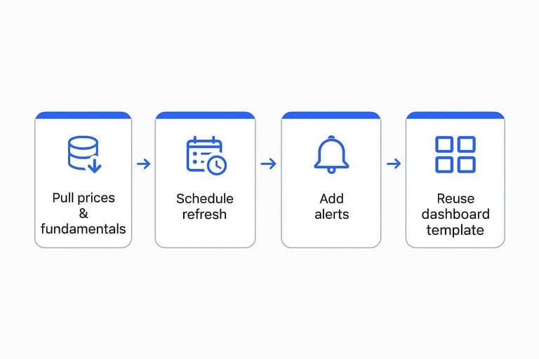
Automation options
Automate the parts you do every week, not the parts you do once. Start small and only add complexity when it removes real friction.
- Pull prices and fundamentals via API or CSV export.
- Schedule a daily or weekly refresh in your spreadsheet.
- Add alerts for sector relative strength and earnings dates.
- Reuse a single dashboard template for each new 90-day window.
When updates become a button press, you’ll actually run the test on time.
Cost breakpoints
Paid tools earn their keep when they remove recurring manual work or fix data integrity issues. If you’re copying tickers between sites every week, you’re already paying.
Use a simple rule: Monthly tool cost < hours saved × your hourly value. If a $40/month plan saves two hours, it pays at $20/hour.
Pay for fewer hours, cleaner joins, and better alerts. That’s where the compounding starts.
The 90-Day Protocol
Run a 90-day test that measures two things: time saved and outcome quality. You’re not trying to “beat the market” in a month. You’re judging whether a sector lens makes your process faster and more repeatable.
Baseline week
Spend one week capturing your normal behavior so you have a clean before-and-after. Keep your usual tools and habits, even if they’re messy.
- Log daily research minutes, split by reading, screening, and news.
- Time each decision from “idea” to “order placed.”
- Record every portfolio change, even small trims.
- Write a one-line reason for each trade, no sector mention.
- Save your watchlist as a dated snapshot.
If you skip this week, you’ll confuse “new system excitement” with real efficiency.
Sector workflow
Use one repeatable weekly loop for 12 weeks. Consistency beats sophistication, because you’re testing ROI, not your IQ.
- Run a weekly sector scan and note trend, breadth, and volatility.
- Rank sectors 1–11 using the same scoring rubric each week.
- Pull 3–5 candidates from top sectors, plus one “avoid” list.
- Set risk limits upfront: position size, stop, and max sector exposure.
- Document the decision, then place the trade or explicitly pass.
Your edge here is fewer decisions, made faster, with clearer constraints.
Tracking template
Track only what can prove time-saved ROI without turning into a second job. If it takes longer to track than to trade, you’ve already failed the test.
Record each week:
- Minutes spent: scanning, deep research, and monitoring
- Actions taken: buys, adds, trims, exits, and “no trade” decisions
- Sector thesis: one paragraph, plus one “disconfirming” signal to watch
- Entry/exit rationale: trigger, invalidation point, and expected timeline
- Performance: position return and sector ETF return, plus your benchmark
A lightweight log beats a perfect one, because you’ll actually keep it.
Midpoint review
Day 45 is where you kill complexity and keep what works. Answer these questions in writing, then change one thing at most.
- Is weekly research time dropping, or just shifting categories?
- Are decisions clearer, or are you adding new rules?
- Are you trading less, but with more conviction?
- Are outcomes different versus benchmark, or just different versus feelings?
- What can you delete next week without losing signal?
If you can’t simplify at day 45, the system will collapse by day 90.
Real-World Example
You want to know if sector-based stock picking saves time without wrecking returns. Here’s a realistic 90-day test from a part-time investor with a job, a calendar, and imperfect discipline.
Starting portfolio
The account started at $48,000, split across 14 stocks and 2 ETFs. Turnover was high for a “long-term” plan, averaging 5–7 trades per month.
Constraints were real: 2–3 hours per week max, no options, and no day trades. Skill level was competent but not pro, with one edge: “I can read earnings decks fast.”
The baseline problem wasn’t returns. It was attention.
Week-by-week highlights
The goal was simple: use sector strength to narrow research, then only act on clean signals. You track notable moments, not every headline.
- Week 1: Tech led breadth; you paused new buys.
- Week 2: Financials improved; you screened banks and insurers.
- Week 3: Avoided a small-cap “story” trade on weak sector trend.
- Week 4: Added a healthcare name after relative strength held.
- Week 6: Energy broke down; you trimmed instead of “buying the dip.”
- Week 8: Mistake: chased a green day, ignored sector roll-over.
- Week 10: Industrials turned up; you rotated one laggard out.
- Week 12: Stayed put during CPI noise; sectors stayed aligned.
Your best decisions were boring. Your worst one was urgent.
Time log results
Before the test, time was scattered across watchlists, news, and “maybe” ideas. After the test, time moved into one weekly sector scan and fewer deep dives.
Weeks 1–4 averaged 160 minutes per week before, and 115 minutes after. Weeks 5–8 averaged 150 minutes before, and 95 minutes after.
Weeks 9–12 averaged 140 minutes before, and 90 minutes after. The biggest saver was skipping earnings previews for weak sectors.
The biggest sink was second-guessing rotations on red days. Your calendar improved first, then your confidence.
Lessons learned
Time savings came from fewer decisions, not faster decisions. Rules did the heavy lifting.
- Start with sector trend, then pick stocks.
- Cap research to two names per sector.
- Skip weak sectors, even with “cheap” valuations.
- Prewrite sell rules to avoid panic edits.
- Log every trade reason in one sentence.
If you can’t explain the trade in one line, you’re already in a rabbit hole.
If you find the workflow increases churn, the evidence that frequent trading hurts individuals is well summarized in Trading is Hazardous to Your Wealth.
Cost vs Benefit Table
You’re testing whether sector-based stock picking saves time and improves decisions over 90 days. Track costs like a business, then grade benefits with a confidence level you’d defend.
| Task | Time cost | Dollar cost | Benefit type | 90-day confidence |
|---|---|---|---|---|
| Build sector watchlist | 2–4 hours | $0 | Faster idea intake | Medium |
| Weekly sector scan | 30–60 min/week | $0 | Time saved | High |
| Earnings + macro calendar | 60–90 min setup | $0–$30 | Fewer surprises | Medium |
| Sector ETF baseline | 30 minutes | $0 | Better benchmark | High |
| Deep-dive 2 companies | 3–6 hours each | $0 | Conviction upgrade | Low–Medium |
| Rebalance rules + log | 60–90 min setup | $0 | Decision clarity | Medium |
If confidence stays low, you’re paying analysis hours for entertainment, not edge.
Run Your Own 90-Day Pass/Fail Test
- Define “success” in one sentence (time saved, fewer duplicated checks, faster rebalancing decisions) and set a weekly time budget.
- Build the minimum stack (reliable sector classification + a screener + alerts) and start a baseline week with a strict time log.
- Follow the sector workflow for 12 weeks, using the same tracking template and a midpoint review to remove any steps that don’t move your benefit scoreboard.
- At day 90, compare total hours saved and decision outcomes against tool costs and your pass/fail rules—then keep, downgrade, automate, or drop the sector view with confidence.
Turn Sector Views Into Leaders
Your 90-day sector-based ROI test works best when the inputs stay consistent and easy to review after every close, without bloating your routine.
Open Swing Trading streamlines sector/theme rotation, breadth, and daily RS rankings so you can build a focused watchlist in minutes—get 7-day free access with no credit card.