Traders Daily Dashboards: 6 Limits in Choppy Markets
A trader-focused collection on why daily dashboards break down in choppy markets—and how to adapt—covering lag/revisions, false precision, signal crowding, context loss, risk mirages, and workflow friction (plus where dashboards still win).
Traders Daily Dashboards: 6 Limits in Choppy Markets
A trader-focused collection on why daily dashboards break down in choppy markets—and how to adapt—covering lag/revisions, false precision, signal crowding, context loss, risk mirages, and workflow friction (plus where dashboards still win).
If your dashboard looks “clean” on a choppy tape, that’s often the problem: the market is moving faster than your indicators, and the numbers can feel certain right when uncertainty is highest.
This collection walks you through six specific limits that show up in range-bound, whipsaw conditions—how close-based signals mislead, why thresholds and correlations drift, how crowded indicators create reflexive traps, where context and microstructure get lost, how risk metrics mask exposure, and what workflow fixes keep you decisive without adding noise.
Scope and stakes
Daily dashboards promise a clean read: “Here’s the tape, here’s the risk.” In choppy markets, that promise gets stress-tested fast. The same signals that guide you on trend days can push you into overtrading on mean-reverting ones.
What counts dashboard
A daily dashboard is your compact decision surface: levels, breadth, vol, flows, news, and risk gauges in one place. It can be end-of-day prep (“tomorrow’s map”) or intraday reference (“don’t lose the plot”). Typical tiles include key index levels, advance/decline, VIX term structure, dealer gamma, credit spreads, major headlines, and position/risk limits.
The line that matters is time horizon: dashboards help planning, not prophecy.
Chop market profile
Chop isn’t “no signal.” It’s conflicting signals arriving faster than your process can adapt.
Chop market profile
Chop isn’t “no signal.” It’s conflicting signals arriving faster than your process can adapt.
- Mean-reversion dominates, trends fade quickly
- Whipsaws punish tight stops and late entries
- Low trend persistence, high noise-to-signal ratio
- Regime flips after one catalyst headline
- Spread widening increases hidden execution cost
If you feel “right” and still lose, you’re probably paying the chop tax.
Viability question
The real decision is whether your dashboard improves execution, not whether it feels informative. It helps when it narrows choices to a few high-quality setups and clear no-trade zones. It misleads when it encourages constant interpretation, like “breadth is green so buy,” in a market designed to fade confidence.
Good enough looks like this: fewer clicks, fewer reversals, and smaller unforced errors.
Limit 1: Lag and revision
Dashboards built on closing prints and revised series show up after the trade already happened. You get clean lines and confident signals, but they’re stale when the market is choppy.
Example: your dashboard flashes “risk-on” at 4:05pm, right after a 2% intraday round-trip.
Close-based blindness
Close-based dashboards compress a whole day into one dot. In choppy tape, that dot can hide the only tradable move.
A day can go -1.2% at noon, then close +0.1%. Your dashboard reads “flat,” but you just lived a full trend and a full reversal.
Trade the path, not the postcard.
Revisions and restatements
Many “objective” inputs get revised after you’ve acted. Your dashboard doesn’t just lag price, it rewrites history.
- Economic surprises get recalculated with updated consensus
- Positioning surveys update after late reports
- Seasonal adjustments change past months
- Earnings updates revise guidance or restate results
- Index rebalances revise constituents and weights
If it can be restated, it can’t be your real-time trigger.
Mitigation tactics
You can keep dashboards, but you need better hygiene.
- Timestamp every metric with “as-of” and “released-at” times.
- Split panels into nowcasts versus confirmed, revision-safe data.
- Add an intraday “damage check” for range, reversals, and key levels.
Once you can see what’s final, you stop mistaking delay for conviction.
Limit 2: False precision
Tight thresholds and composite scores look “scientific” on a dashboard. In choppy markets, volatility clustering quietly rewires relationships, and your clean lines stop behaving.
Threshold trap
Brittle rules feel objective because they’re crisp. They also fail fast when chop changes microstructure and noise.
- RSI 70/30 cutoffs as buy/sell gates
- Breadth must-clear percentages like “65% advancing”
- Put/call bands treated as hard extremes
- Price “above/below VWAP” as a binary truth
- Fixed ATR multiples for stops and targets
If you need a decimal to believe it, you’re already overfitting.
Correlation drift
Backtests assume yesterday’s indicator relationships will hold tomorrow. In chop, factor exposures rotate, lead-lag flips, and correlations compress or spike without warning.
You stack “breadth + momentum + vol” into one score, then volatility clustering turns them into the same trade. Your composite still prints confidence, but it’s just duplicate risk.
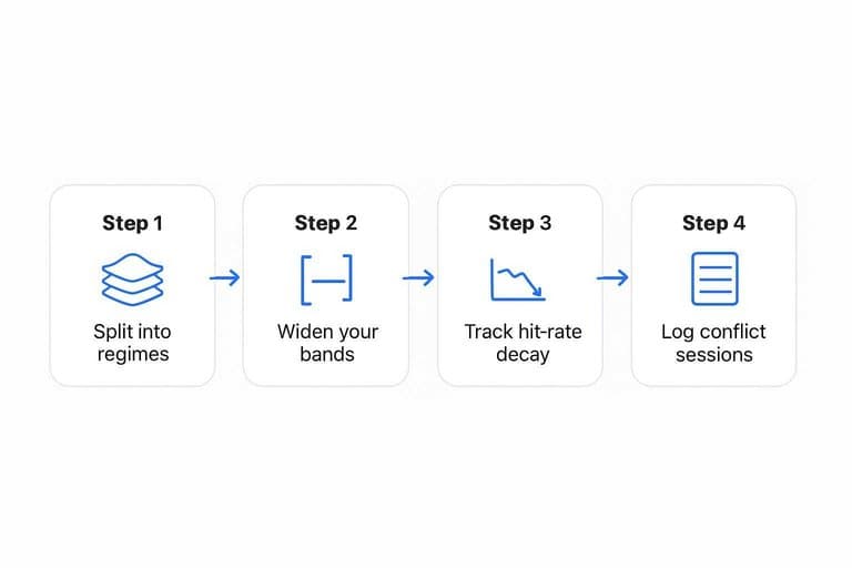
Stress-test routine
You need a quick routine that makes brittleness visible before size goes on.
- Split history into regimes using realized vol and trend strength.
- Widen your bands and re-run triggers at each width.
- Track hit-rate decay as thresholds loosen from “perfect” to “plausible.”
- Log sessions where signals conflict with tape and close.
When performance collapses as you widen bands, you found false precision, not edge.
Limit 3: Signal crowding
Dashboards are supposed to reduce noise. In choppy markets, they can synchronize you into it.
When everyone watches the same tiles, trades cluster around the same “obvious” levels. That’s how you get clean-looking signals that still whipsaw.
Consensus indicators
A few popular inputs show up on almost every trader’s screen. They feel “market-wide,” so they become default decision triggers.
- VIX term structure
- Advance/decline line
- Gamma exposure (GEX)
- DXY
- 10Y yield
- CTA positioning estimates
If your dashboard matches the crowd, your entries will too.
Reflexive loops
Shared dashboards create shared reactions. You see “support,” they see “support,” and everyone leans the same way.
Once price tags that level, flows hit at the same time, liquidity thins, and the move overshoots. Then the same group flips when the tile changes color, and chop tightens around those levels like a magnet.
That’s coordination without communication, and it’s brutal in ranges.
De-crowding moves
Treat your dashboard like a portfolio. Diversify signals, then cut what you won’t act on.
- Add one orthogonal signal per theme, like options skew or dealer inventory.
- Cap indicator count, and remove anything you don’t trade from.
- Rotate one “cold” metric monthly, like freight or credit spreads.
- Hide unused tiles by default, and force a manual reveal.
If a tile doesn’t change your trade, it’s just crowd noise with better typography.
Limit 4: Context loss
Dashboards excel at “what happened,” but they usually fail at “why now.” In choppy markets, that missing narrative hides microstructure shifts, where liquidity vanishes and price jumps on fragile flow.
Microstructure blind spots
Dashboards flatten the tape into clean candles and neat indicators. You lose the messy mechanics that decide whether a move is real or just “no liquidity, one print.”
When context disappears, you miss:
- Liquidity pockets and air gaps that turn small orders into big moves
- Auction dynamics where price discovery happens in bursts, not smoothly
- Options pinning near strikes that magnetize spot late in the session
- Dealer hedging flows that reverse intraday, especially near gamma flips
- Spread and impact regime shifts where your fill quality suddenly collapses
If you can’t see how it traded, you can’t trust what it printed.
Calendar landmines
A dashboard can look “broken” on days when the calendar is the real driver. Those days produce fake signals and unreliable liquidity.
- Futures roll dates
- Options expiry and dealer resets
- Index rebalance windows
- Open and close auctions
- Macro releases and earnings clusters
Your edge often starts with knowing which days not to infer anything.
Context overlays
You can keep the dashboard, but you must graft the story back onto it. Build lightweight overlays that explain when the tape lies.
- Tag charts with event labels, like “roll,” “FOMC,” or “quad witching.”
- Add liquidity proxies, like spread, depth, and realized slippage.
- Plot auction markers for open, close, and key imbalance windows.
- Maintain a “no-trade” calendar panel inside the dashboard.
- Write one line of intent, like “only fade extremes, no breakouts.”
Once context is inside the tool, discipline stops being a memory test.
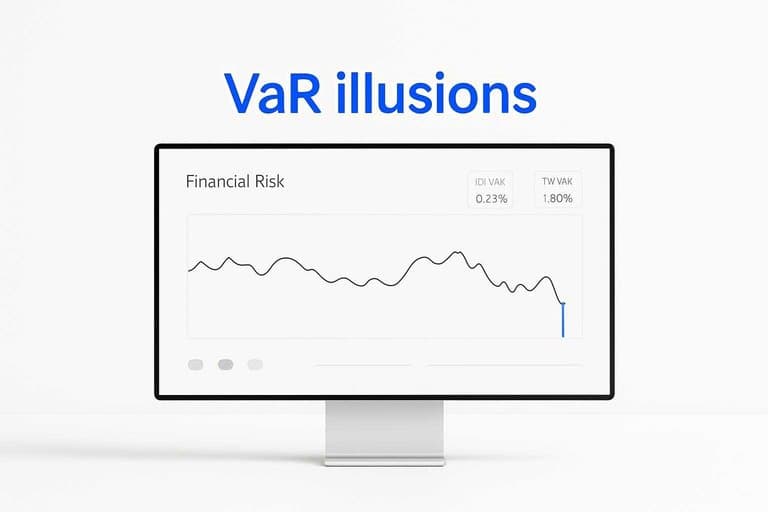
Limit 5: Risk mirage
Dashboard risk widgets often look calm in chop. They understate tail risk, so you size up and bleed on “small” losses. You feel hedged, then the tape gaps and your widget stays polite.
VaR illusions
VaR looks scientific, so you trust it. In choppy markets, short windows and bell-curve assumptions turn it into a comfort blanket.
Short lookbacks overweight the most recent micro-regime, so the estimate resets right before the jump. Normality ignores fat tails, so a 6-sigma move becomes “impossible” on paper. Serial correlation breaks the independence assumption, so losses cluster and compound across days.
If your VaR drops while your P&L swings widen, you’re watching model risk, not market risk.
Hidden exposures
Most dashboards track position size and headline volatility. They miss second-order risks that appear only when chop turns violent.
- Correlation spikes across “diversifiers”
- Vol-of-vol that reprices options fast
- Gap risk through stops and auctions
- Basis risk between hedge and asset
- Hedging slippage from thin liquidity
If you can’t see these, you’ll keep paying for them in tiny invoices.
Hard risk rails
You need rules that beat your dashboard on the worst day. Hard rails keep you alive when the widget lies.
- Set a daily loss limit and a weekly loss limit.
- Cut size automatically when realized vol and whipsaws rise.
- Run scenario shocks beyond history, including gaps and correlation breaks.
- Predefine exits: stop type, time stop, and “no re-entry” cooldown.
When chop turns predatory, automation beats discretion.
Limit 6: Workflow friction
Maintaining dashboards steals attention when you need it most. In choppy markets, the upkeep adds latency, and “one more panel” becomes your new procrastination. You end up checking boxes like “risk OK” instead of actually thinking, “What’s the trade?”
Attention tax
Dashboards fail when they turn your focus into a loop. You keep looking because you feel busy, not because you’re learning.
- Tile-hopping instead of holding one question
- Over-monitoring micro-moves instead of the regime
- Alert fatigue that trains you to ignore signals
- Confirmation seeking by swapping timeframes and filters
- Delayed execution while you “double-check”
If your eyes move more than your orders, you’re paying an attention tax.
Operational fixes
Fewer metrics beat more panels because they force a decision. A clean dashboard says, “If A, then do B,” not “Keep watching.” Replace five weak indicators with one decision gate, like “volatility expanding: reduce size,” and you’ll trade faster and cleaner.
The goal is not visibility. It’s commitment.
Simplify the build
Rebuild your dashboard around decisions, not data.
- Create a one-page core view with only trade-critical metrics.
- Set two scheduled review times, and ignore everything between them.
- Add alert thresholds that trigger actions, not curiosity.
- Add a post-trade notes strip for one-line rationale and outcome.
If it doesn’t change your next action, it’s decoration. For context on how market conditions can shift across regimes (and why over-monitoring can mislead), see this overview of regime changes and financial markets.
Where dashboards still win
Dashboards can still help when your market is noisy and your brain is louder. Use them for fast situational awareness, not for “the signal.”
| Use case | Dashboard value | Failure risk in chop | Best companion tool |
|---|---|---|---|
| Exposure and leverage | Spot over-sizing fast | False confidence | Position sizing rules |
| Regime and volatility | Confirm “risk on/off” | Late regime calls | Volatility filter |
| Execution quality | Catch slippage spikes | Confuse noise for edge | Trade journal tags |
| Rule compliance | Flag broken constraints | Over-alert fatigue | Pre-trade checklist |
| Portfolio correlation | See crowding early | Correlation whipsaws | Scenario stress test |
Treat dashboards like cockpit instruments. They keep you off the rocks, not on the treasure.
Rebuild Your Dashboard for Chop—Then Trade the Reality in Front of You
- Label the regime first: add a simple “chop vs trend” toggle so every metric is interpreted through the right lens.
- Replace single-threshold calls with ranges and stress tests: require confirmation across timeframes and run quick correlation/volatility checks before trusting precision.
- De-crowd and contextualize: cap overlapping indicators, add microstructure/calendar overlays, and keep a short “what can go wrong today” panel.
- Put hard risk rails above the visuals: track hidden exposures, set non-negotiable limits (size, loss, liquidity), and simplify the build so the dashboard reduces decisions instead of multiplying them.
Find Cleaner Breakout Leaders
In choppy markets, dashboards can lag, overfit numbers, and miss context—making it harder to separate real leadership from noisy moves within your daily routine.
Open Swing Trading helps you screen ~5,000 stocks with daily relative strength, breadth, and sector/theme rotation context—built for discretionary chart users. Get 7-day free access with no credit card.